I never used to talk about my colour blindness until this year when I realised just how “colour blind” I really was. It’s something that you are born with and my parents didn’t know until I was around 5 when I was unable to see our dog’s red ball on the grass.
To be clear here, I do see colours, as do most of the color blind population. Being able to see colour but not all colour is actually known as Colour Vision Deficiency (or CVD because us IT folk love our acronyms)
My issue is that I mix up the following:
- Blue, Pink, Purple
- Red, Green Brown
- Yellow & Orange
I’ve been to see the doctor to determine what type of CVD I have but they didn’t really know what to say other than show me some circles with dots on and tell me what I already know. I’ve also asked my opticians buy they don’t have the training to diagnose. According to the EnChroma test I have Protanopia CVD but after doing a bit of research I also think I have a bit of Deuteranopia thrown in there.
Day to day
I find that I don’t really “care for” colours as much as others so I don’t absorb them into my brain. For example you might remember what colour a car was parked outside your house but I usually couldn’t tell you, I just don’t remember those things. – It’s not as if I would know what it was anyway! 🙂
I would say that with certainty I can tell you the colour of probably 25% of what I see. The next 50% I can usually guess by using some form of common sense (Grass is commonly known to be green and a guy would probably wear a blue shirt over a pink or purple one) and the final 25% I have no idea at all such as the London tube map!

How does CVD affect working in IT?
In normal day it really doesn’t affect me. I’ve adapted, I know what colours to expect; green is good, red is bad and if I’m not sure there is usually a user interface or someone around to just tell me.
Some things that I do get caught on are:
- Patch cables. Green & Grey look the same
- Some LEDs: Red and green look similar – Always check the UI!
- Charts: Usually pie charts, it’s almost impossible to match colours to a “key” or distinguish between some of them in the first instance. Although line charts are also difficult sometimes
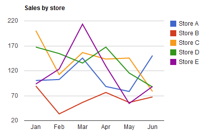
I mentioned before that I apply common sense to work out a colour. I do this now without even thinking about it. For example take this line chart:

The lines that start at approximately 170 and 200 look the same to me. I refer to the key, C and D look the same so those must be the lines that I can’t work out.
I need to think of a way to work out which is C and D
Since I have access to the raw data table all I need to do is find the raw data for Jan that is around 170 and I will know which line that is. Then I will know which the other line is at the same time #win!
Obviously this takes a little extra time but still much faster than having to read all the raw data.
Examples
Interestingly on every example, both images look the same to me but I am assured that they are different! (Thanks Jamie)
For the website conversions I used https://www.toptal.com/designers/colorfilter
Further information
Did you know that 1 in 12 men have some form of CVD?
Test yourself: http://enchroma.com/test/instructions
Colour blindness website: http://www.color-blindness.com/what-is-color-blindness
I follow these guys on Twitter: https://twitter.com/colourblindorg
As always, reach out on Twitter or below with any questions


